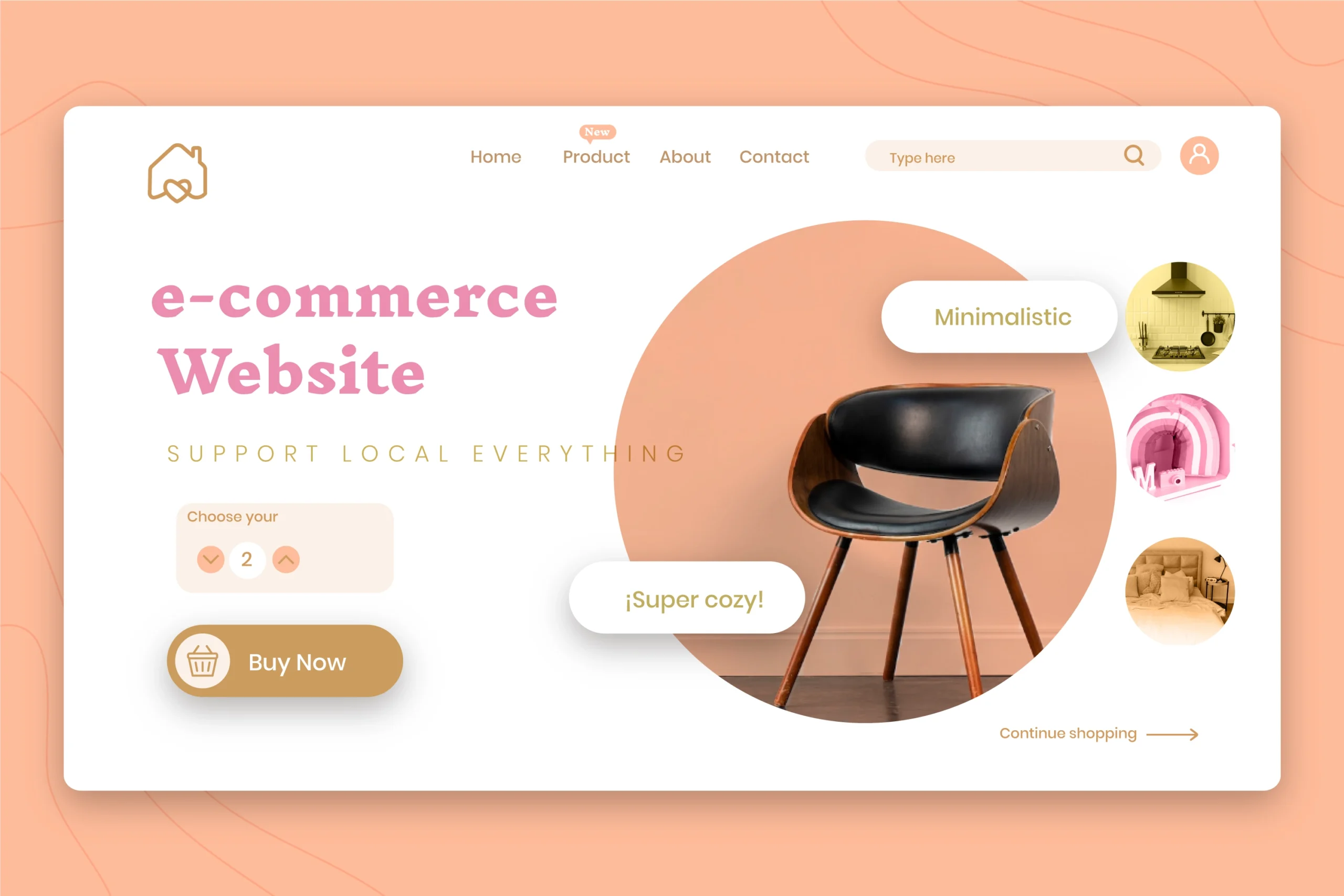
The term Responsive website isn’t just a marketing buzzword software companies use to charge you more money. Rather, the idea that your website adapts seamlessly to different screen types is one of the most crucial principles a web designer must follow. This ensures users get the best experience when visiting and browsing your site, directly impacting traffic rates and overall success. In this article, we’ll discuss responsive design fundamentals and its importance for your website—both for your business success and as an effective marketing channel.

What is a Responsive Website?
When you browse websites on different devices—whether from your computer, mobile phone, or tablet—do you face any major issues? No, because web developers naturally design sites to support various screen sizes, ensuring the best possible display. This is the core idea of a responsive website: it appears differently based on each screen to suit its dimensions perfectly.

The concept of Responsiveness appears in the visual changes to the website’s appearance—not its functionality—based on screen size. For example, consider every website’s Header and main navigation menus. On desktop, the main menu displays naturally across the header for easy browsing. But on mobile, it transforms into a side menu with a dedicated button—what we call the Hamburger menu—making access easier and clearer on smaller screens. Got the idea?
Fundamentals of Responsive Websites
There are essential rules that web designers and developers must follow to ensure optimal display across all devices. We’ll cover these in this section, but don’t worry—we’re not giving a full programming course, just the key basics you need for a standout responsive site.
Use Grid Systems
The first rule for handling website elements smoothly is Fluid Grids. Imagine your entire site follows a flexible table system of columns and rows. Controlling these columns and rows lets you manage layout across different screens. For example, display 3 columns on large screens (1920px) suitable for desktops, but switch to 1 column when the screen shrinks to 1080px for mobile devices.

CSS Media Queries Code
When coding your site’s CSS, you’ll need Media Queries to optimize for different screens. In 2025, mobile-first design is standard since most traffic comes from smartphones. Place queries for larger screens above mobile code. For example, target desktops with: @media (min-width: 992px) {}

- Desktop screens: minimum 992px
- Tablet screens: minimum 768px
- Mobile screens: 576px average, up to 768px max for larger phones
Use max-width for Fluid Images
Now here’s a problem: imagine you have a 1440p image. That’s too high-resolution even for average computers (1080p screens). How do you fix it? Use max-width code to control image display: max-width: 100%; height: auto; width: auto; This makes images fit their container perfectly without overflowing, ensuring great display across all devices without breaking the reading experience.

Use Structured HTML Code
For CSS to handle your site excellently and control screen widths, your HTML structure must be clear and readable. Organize Semantic tags like <section>, <main>, and <header> logically. Always include this viewport meta tag in your <head>: <meta name="viewport" content="width=device-width, initial-scale=1"> And use srcset for images: <img src="small.jpg" srcset="medium.jpg 768w, large.jpg 1200w" sizes="(max-width: 768px) 100vw, 50vw">

Adjust Font Sizes
This isn’t essential for responsiveness itself since fonts don’t affect layout response, but the idea is ensuring appropriate font sizes for each screen. You don’t want visitors struggling to read content on smaller screens and resorting to Zoom in. This negatively impacts your site, so avoid it.
Don’t Show Everything on Every Screen
A common developer challenge is designing service pages with content and images that don’t work well across all screens. Solution? Content is king—hide images on mobile and design pages that work for both mobile and desktop. Show images on desktop to maintain readability and aesthetics, while hiding them on mobile to focus on content with subtle visual appeal.
A Simple Mistake to Avoid
Horizontal Scroll bar appearance. This simple error destroys all your responsive efforts. A horizontal scrollbar means your site isn’t truly responsive. For the best user experience, navigation should be vertical only—no other scrolling directions.
The Importance of Responsive Websites
A responsive website greatly strengthens your site’s power, builds brand trust, and drives marketing success. How can one website achieve all this?
Easy Browsing = Greater Trust
Put yourself in your customer’s shoes. As a customer wanting to buy online, if store navigation is difficult, would you purchase? You want easy access to product pages, cart, features, and specs. But if I, as the developer, make the mobile cart button overlap the account page, use huge image galleries that delay reaching specs, and conflict the “Add to Cart” button with product images. would you buy from me?

After this exhausting experience, even if you buy once, you won’t return. You’ll seek competitors. But provide a perfect, simple shopping experience and you’ll become their go-to store—not just for specific products, but for discovery itself.

This applies to company and service websites too. You won’t choose a company where reading services is difficult. Imagine visiting an Egyptian pest control company to book an appointment, but can’t easily find “Book Appointment,” prices are hidden, and material details are missing. You’d choose competitors. How can you trust them with such a website?
Better Website = Better Google Rankings
No doubt SEO is a crucial marketing channel. The key question: how do you rank well? Learn more in our SEO Services. One major factor is your site’s responsiveness and ease of use. Poor sites aren’t favored by search engines, no matter your content quality. Improve your site—it’s critically important.
Professional Website = Professional Business
In our current world, people judge by appearances. Website owners must prioritize responsiveness. A responsive website means you seek details—proof of your attention to detail. As a buyer or service seeker, I want assurance you’ll care about my service details. If your site lacks detail, how will you care about mine? This psychological marketing point transcends algorithms: Good site = Detail-oriented owner = Care for my needs. Simple equation, profound impact.
Get a Responsive Website Easily
Creating an excellent, balanced responsive website isn’t rocket science—most developers can build decent ones. But integrated professionalism? You’ll only find it at Tiye Solutions. Get our Web Development Services from Tiye Solutions now—just contact us and let’s build something amazing together.


