
Brand identity design is more than a recognizable logo. It is a visual and verbal system. It helps people recognize, understand, and remember a business. Brand identity design services bring these elements together to create a consistent identity that reflects the company’s personality, values, and market position. From colors and typography to messaging and visual style, every detail should support one goal. Make the brand clear, distinct, and meaningful.
For businesses competing in a crowded market, a professionally designed identity can help make a stronger first impression, build credibility, and make marketing activities more consistent across digital and physical touchpoints.
What is brand identity design?
Brand identity design is the process of creating the visual and communicative elements that represent a business. According to the American Marketing Association’s definition of brand identity, there are many elements that help people recognize a brand and build a connection with it.
However, effective identity design goes beyond making a business look attractive; it translates the brand’s personality and positioning into a system that can be used consistently across websites, social media, packaging, advertising, printed materials, and other customer touchpoints.
Essential Elements of a Strong Brand Identity
Before getting into the details: brand identity is not just a “pretty face,” but an integrated visual and verbal system that builds trust and facilitates business recognition at every customer touchpoint. The more consistent these elements are, the higher the “brand recall” among the audience, which subsequently reflects on direct searches for the brand name—one of the strongest trust signals in the eyes of search engines themselves.
To illustrate each element practically, we will accompany it with an example from a single continuous hypothetical case study: “Athar” Cafe, which started as a small, unorganized shop and then completely rebuilt its identity when expanding to new branches.
Note: The following case study is entirely hypothetical for illustrative purposes, and the figures in it are estimates, not real data.
1- Logo
The logo is the visual mark that people associate with the business. It must be distinctive, easily recognizable, and flexible enough to work at different sizes and across multiple platforms. Its goal is not only to “look attractive” but also to reflect the business’s personality and remain clear whether it appears on a website, a social media profile, product packaging, or printed material.
Main Types of Logos
- Wordmark: The brand name written in a distinctive font without an icon.
- Lettermark: Initials only, suitable for long names.
- Pictorial Mark: A visual icon without text.
- Combination Mark: A symbol and text together, the most common for emerging brands due to its flexibility.
- Abstract Mark: A geometric shape whose meaning is built over time.
- Emblem: Text inside a frame or seal, giving a traditional feel.
Criteria for a Successful Logo
Simplicity, relevance to the nature of the business and audience, scalability, timelessness with its own continuous personality rather than following a trend, and distinctiveness from competitors’ logos.
Technical Considerations for Professionals
- File Formats: The logo must be available in vector formats (SVG, EPS, AI) alongside a PNG with a transparent background.
- Alternative Color Versions: A monochrome version for thermal printing and dark/light backgrounds.
- Clear Space: A mandatory empty space around the logo.
- Minimum Size: The smallest size that can be printed without losing clarity.
Practical Example: Athar Cafe
The original logo was a quick sketch designed by a friend of the owner, lacking a vector or monochrome version, so it appeared distorted when printed on small cups. Upon rebuilding, a combination mark was designed: a coffee bean forming the features of the letter “A”, with a separate icon version for the mobile app, and a monochrome version dedicated to printing on paper cups and invoices. The result: a single logo that works without distortion from a 32-pixel icon size to an external branch sign.
Common Mistake
Relying solely on a final image file without keeping the original editable source, or using fine details that do not appear when viewing the logo in its natural state—these points strongly affect the final look of your brand’s logo.
2- Color Palette
The color palette defines the primary and supporting colors used by the brand. Colors influence the feeling the brand conveys and enhance visual recognition over time. A brand may use bold colors to express vitality or muted tones to impart a sophisticated look. The most important factor is strategic selection and consistent application.
Professional Palette Structure
- Primary Color: The most associated with the identity, often appearing in the logo.
- Secondary Colors: Support the primary color and add variety.
- Neutral Colors: For backgrounds, texts, and eye comfort.
Overview of Color Uses
| Color | Common Associated Feeling |
|---|---|
| Blue | Trust, Professionalism, Calmness |
| Red | Vitality, Urgency, Passion |
| Green | Growth, Nature, Sustainability |
| Yellow/Gold | Optimism, Luxury (depending on the shade) |
| Brown/Earthy | Warmth, Authenticity, Craftsmanship |
| Black | Luxury, Power, Simplicity |
Advanced Considerations
- Color Models: Documenting each color in HEX (web), RGB (screens), CMYK (print), and sometimes Pantone to ensure color matching between screen and prints.
- Accessibility: Achieving a contrast ratio of at least 4.5:1 between text and its background according to WCAG standards.
- 60-30-10 Rule: A balanced distribution of 60% neutral/primary color, 30% secondary color, and 10% accent color for buttons and focal points.
Practical Example: Athar Cafe
Before standardizing, a brown color was used on the sign, green in the menu, and blue on the Instagram account — without any common logic. The palette was rebuilt around a dark brown as a primary color (the warmth and authenticity of coffee), with a secondary brick/copper hue, a neutral creamy background, and a golden touch for details, distributed in a 60-30-10 ratio across branch decor, prints, and social media alike. Each color was documented with its HEX and CMYK codes in a single file to be handed over to any printing press or future designer.
3- Typography
Typography refers to the types of fonts and typographic styles used across all brand elements. Font choices affect readability and convey the brand’s personality. A professional identity usually defines a clear hierarchy for headings, subheadings, and body text, making the brand easier to recognize and maintaining visual consistency.
Types of Fonts and Their Personalities
- Serif Fonts: Traditional and reliable feel.
- Sans-serif Fonts: Modernity and visual cleanliness, best suited for screen reading.
- Display Fonts: Rich in personality, used cautiously for large headings only.
- Handwritten/Calligraphic Fonts: Personal or creative flair.
For Arabic content, it is worth distinguishing between classic styles (Naskh, Ruq’ah, and Kufi) and modern digital Arabic fonts designed for screen clarity, which is a common choice for contemporary brand identities in the region.
Advanced Considerations
- Economy in Number: A maximum of two to three fonts to avoid distraction.
- Compatibility Between Two Languages: When combining an Arabic and a Latin font, the character height and visual weight must align.
- Technical Performance: Lightweight web fonts speed up site loading, which impacts user experience and performance metrics.
- Licenses: Ensuring a valid commercial, not just personal, license.
Practical Example: Athar Cafe
Previously, menus were written in a different default font in each branch depending on the software used. Later, a clear and modern Arabic font was adopted for body text in the menu and posts, contrasted with a custom display font with a handwritten touch for the name “Athar” in the logo and large headings only—capped at a maximum of two fonts for all materials.
4- Visual Style and Imagery
The visual style dictates how photographs, illustrations, icons, graphics, and other visual elements should look. This may include directing the photography style, image composition, graphic patterns, icon styles, and other recurring visual elements. A consistent visual language helps customers recognize the brand even when its logo isn’t directly visible.
Detailed Components
- Photography Style: Natural or studio lighting, candid or curated shots, and a unified color grading tone.
- Illustration Style: Flat, 3D, or hand-drawn.
- Iconography Style: Thin or bold lines, sharp or rounded corners.
- Graphic Patterns and Textures: Repeating decorative backgrounds as an additional defining element.
Practical Tool
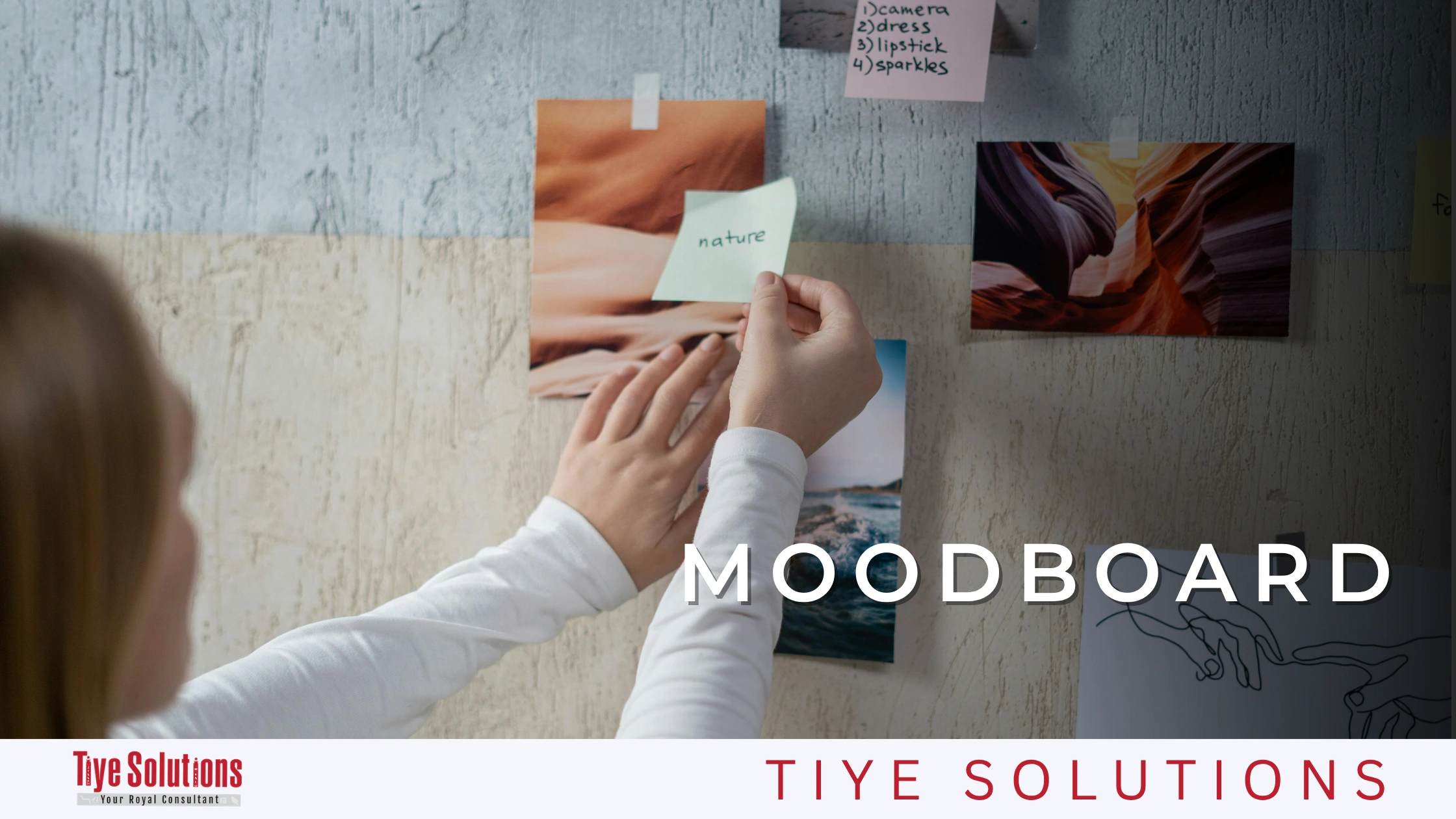
Designing a mood board to empty your thoughts and organize your vision will be a great ally in your work; it will make it easier for you to organize the designs in your mind, and from there, determine the design direction you must follow with the brand.
Advanced Considerations
Maintaining consistency across different sizes (square post, vertical stories, horizontal banner), and extending the same style to video and motion graphics, not just still images.
Practical Example: Athar Cafe
The Instagram account relied on random phone pictures without a unified pattern, which resulted in poor engagement despite the product’s quality. After standardization, photography with warm natural lighting, top-down shots of coffee cups on wooden backgrounds, and unified linear icons for menu categories (hot, cold, desserts) were adopted—all within a single guide handed to every new branch and packaging supplier.
5- An Additional Element That Completes the Picture: Brand Voice
Identity is not limited to what is seen; it also includes how the brand speaks: formal, friendly, or humorous? What are the recurring vocabularies in its messaging? This “verbal identity” must harmonize with everything mentioned above; a bold logo with loud colors contradicts a very dry and formal writing tone.
Practical Example: Athar Cafe
A warm and relatable tone was adopted across all Instagram posts and menus, using short, direct sentences that reflect the same warmth of the brown and gold colors used visually.
Quick Checklist Before Approving Your Identity
- Does the logo work clearly from a small icon size to a large banner?
- Are the colors specified in both HEX and CMYK formats?
- Do the colors observe contrast standards for readability?
- Is a clear font defined for each textual level?
- Is there a written identity guide that compiles all these elements into a single reference?
Brand Guidelines
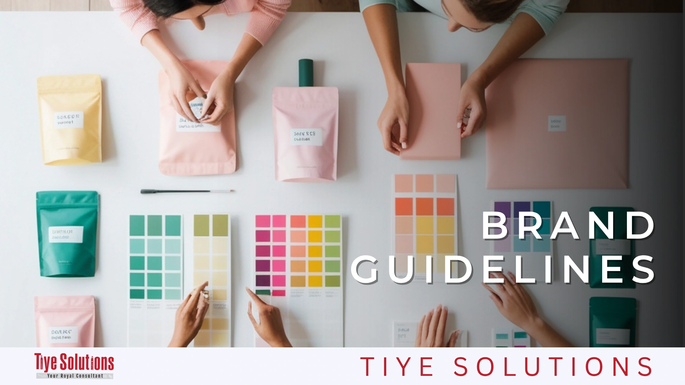
The brand guidelines document how to use the identity correctly and consistently. It usually includes rules for logo usage, color codes, typography, imagery, layouts, messaging, and other standards. This document helps internal teams and external partners (designers, printing presses, and advertising agencies) maintain consistency as the business grows and produces more marketing materials.
In other words, the guide is a “common language” referred to by anyone dealing with the brand, whether it’s a new employee on the marketing team, a freelance designer tasked with designing an advertising banner, or a printing press executing product packaging. Without this reference, every party relies on their personal understanding of the identity, leading to gradual variations (a slightly different color here, a different font there) that accumulate over time and weaken the brand’s cohesion.
What Should the Guidelines Practically Include?
A comprehensive professional guide typically covers the following elements:
- Logo Usage Rules: Permitted sizes, the clear space around it, and correct and incorrect uses (such as warning against distorting its proportions, placing it on a background that hides it, or changing its colors).
- Color Codes: In HEX, RGB, CMYK, and Pantone formats for each color in the palette, detailing the usage proportions of each color.
- Typography Guidelines: The name of each font, its permitted weights, and where each is used (headings, body text, captions).
- Imagery and Illustration Style: Illustrative examples of what is acceptable and what is rejected in terms of lighting, composition, and color grading.
- Layout Rules: The design grid, margins, and how elements are distributed in prints or digital pages.
- Messaging/Tone of Voice: Examples of acceptable phrases and those incompatible with the brand’s personality.
- Mockups: Ready-made examples showing the identity applied to a business card, social media post, product packaging, or email signature—because seeing the actual application is much clearer than just reading theoretical rules.
Size and Format of the Guidelines
There is no one-size-fits-all; a small startup might settle for a simplified 5 to 10-page guide covering only the basics, while a large enterprise with multiple branches or markets needs a comprehensive guide that could exceed a hundred pages, covering specific use cases (like multiple languages or various digital applications).
The guide may be exported as a static PDF file for quick sharing or as an interactive web-based “brand portal” that allows updating rules and downloading official files directly—which is the common choice in large companies with distributed marketing teams.
What Does the Professional Brand Building Process Look Like?
The professional brand-building process should follow structured steps rather than jumping straight into logo design. This strategic approach ensures that creative decisions are based on the nature of the business, its audience, and its competitive environment, not merely on personal taste.
This point exactly is the most common mistake new business owners make: going straight to a designer asking to “make a nice logo,” without going through the research and strategy phases. The result is often a visually attractive logo that does not reflect the brand’s true position in the market, necessitating a complete redesign later that costs much more time and money than if the steps were followed in the correct order from the start.
Below is a detailed explanation of each stage of this process:
1- Discovery & Research
The process begins with understanding the business, including its goals, values, products or services, target audience, competitors, and current market position. Research helps identify opportunities and ensures the resulting identity is relevant, rather than relying solely on personal design preferences.
Practically, this stage involves specific tools and methods, including
- Stakeholder Interviews: Direct questions to the business owner and internal team about the vision, values, and reasons for current success.
- Current Customer Surveys: To understand how customers actually perceive the brand and whether this impression matches or differs from what the business owner desires.
- Competitive Audit: Studying the logos, colors, and communication styles of direct competitors, not to copy them, but to avoid similarities and find a clear visual differentiation space.
- Simplified SWOT Analysis: Monitoring strengths, weaknesses, opportunities, and threats related to the brand’s position in the market.
The output of this stage is usually a brand brief used as a reference for all subsequent decisions in the project, rather than relying on memory or scattered impressions.
2- Brand Strategy
Brand strategy determines the foundation upon which the identity is built; it can define the positioning, personality, values, differentiators, audience, and core ideas the brand wants to convey. This strategic phase gives designers a clear direction and connects the visual identity to the broader business goals.
Among the most prominent deliverables built in this stage:
- Positioning Statement: A short sentence or paragraph clarifying who the brand targets, what it offers, and why it is different from available alternatives.
- Brand Personality: Tools like “Archetypes” are often used to clearly define the brand’s personality—such as the “Hero” (ambition and achievement), the “Sage” (expertise and credibility), the “Creator” (innovation and uniqueness), or the “Everyman” (simplicity and closeness to people). Choosing a clear archetype later guides every design decision, from color selection to writing tone.
- Core Values: The principles the brand never compromises, regardless of how campaigns or products change.
- Target Audience: A precise description of the ideal customer (which may go as far as building “buyer personas” representing different audience segments).
Without this phase, every subsequent design stage becomes merely artistic guesswork disconnected from a clear commercial goal.
3- Visual Identity Design
After establishing the strategy, the visual system can be developed. The goal is to create an integrated and harmonious system rather than a collection of unrelated designs.
This is the stage where strategic decisions (positioning, personality, values) transform into tangible visual elements: the logo, color palette, typography, and the visual style of images and illustrations—the elements detailed previously. The important thing here is that every visual element is justified by referring back to the strategy, not by the designer’s personal taste; for instance, if the strategy defines the brand personality as “sophisticated and calm,” this directs the choice of a neutral color palette and an elegant, minimalist font, rather than loud colors and a bold, thick font.
4- Brand Guidelines (Final Documentation)
The final identity is organized into practical guidelines detailing how to represent the brand. This makes it easier to maintain consistency across websites, social media, advertising, packaging, presentations, and printed materials.
This stage acts as the “official handover” for everything preceding it; instead of design decisions remaining only in the mind of the designer or the original team, they transform into a written reference that anyone new can refer back to later—which is what the guidelines detail in the first section above.
Summary Table: The Four Stages of Brand Building
| Stage | Question and Answers | Main Deliverable |
|---|---|---|
| Discovery & Research | Where do we stand now? Who is our audience and who are our competitors? | Brand Brief |
| Brand Strategy | Who are we and why do we stand out? | Positioning Statement + Brand Personality |
| Visual Identity Design | How do we look visually? | Logo, Colors, Fonts, Visual Style |
| Brand Guidelines | How do we use all of this consistently? | Written Guidelines Document |
This sequential order ensures that every stage builds on the one before it, rather than working on the logo and colors in isolation from a true understanding of the brand’s position and audience.
Start Designing Your Brand Identity Today
Now that you recognize the essential identity elements (logo, colors, typography, visual style), understand how the brand guidelines document all of this, and are familiar with the professional brand-building stages from research to final handover—there remains one decisive step between theoretical knowledge and actual real-world results: Choosing the right partner who transforms these stages into a real identity for your business.
Whether you are launching a new project or feel that your current identity no longer reflects the size of your business and ambition, the right time to start is now, because every day a brand delays having a consistent identity is a day it loses opportunities to stand out and be remembered in the minds of customers. But before contracting with any agency, it is important to know exactly what you are looking for.
What to Look for When Choosing a Brand Identity Design Agency?
Choosing an agency to design your identity requires looking beyond attractive designs on a sleek “portfolio” page. A beautiful logo alone does not make a successful brand if it is not built on a true understanding of your business nature and audience. The right partner is the one who understands both creative execution and business strategy together, not just one of them. Here are the key criteria on which any agency should be evaluated:
1- Strategic Thinking Before Creative Execution
The brand that deserves your trust is the one that starts its questions with “Why” instead of “How.” A good agency must question why you need a new identity and the commercial problem this identity should solve—is it poor differentiation from competitors? Or is it an inconsistency that led to customer confusion? Or is it an expansion requiring a more professional identity? Subsequent design decisions should support your brand’s positioning, audience expectations, and long-term goals, rather than being isolated artistic guesses.
A practical question to ask any agency: “How do you usually start a new identity project?” If the answer jumps straight to talking about colors and fonts without mentioning any prior research or strategy, that is a red flag.
2- Expertise in Your Business Industry
An agency’s expertise in your specific field (such as restaurants, real estate, e-commerce, or professional services) can help in understanding customer expectations, competitors, and common communication challenges within that sector. However, this expertise should not turn into a blind repetition of the widely accepted methods in the industry; a good agency leverages its market understanding to introduce fresh ideas that distinguish you from your competitors, not to design another copy of what already exists.
3- A Strong and Diverse Portfolio
Review the agency’s past projects with a critical eye, and specifically look for work that demonstrates:
- A genuine ability to build integrated identity systems (logo + colors + fonts + cohesive visual style), rather than isolated attractive logos without context.
- Diversity across sectors and styles, indicating creative flexibility rather than a “ready-made template” repeated with every client.
- Examples of practical identity application on real materials (websites, packaging, social media), not just displaying the logo on a white background.
4- Knowledge of the Local Market
For companies operating in Egypt specifically, understanding local consumers and the dynamics of the Egyptian market is a true added value. An agency with local market knowledge can create an identity that is culturally and behaviorally appropriate for your target audience, while simultaneously helping you stand out from direct local competitors—which is hard to achieve by relying solely on generic global design templates that do not account for market specifics.
Additional Criteria Recommended to Verify
Alongside the above, it is also practically useful to ask about:
- Clarity of the Workflow and Timeline: Are there defined stages with clear deliverables at each stage, or is the process vague?
- What You Actually Receive in the End: Does the handover include editable source files and a written identity guide, or just a final logo?
- Quality of Communication During the Project: A team that explains its design decisions and links them to your strategy is far better than a team that presents ready-made options without justification.
Why Choose Tiye Solutions for Your Brand Identity Design?
Tiye Solutions combines the aforementioned criteria in a specialized brand identity design service that begins with understanding the business, its story, its values, its audience, and its competitors before moving to design the identity and delivering it fully alongside the brand guidelines. This ensures it connects to the core of the brand rather than being an isolated logo. The agency supports its work with market research capabilities covering competitors and customer behavior, along with a diverse client portfolio, guaranteeing you receive a consistently distinguished service that exceeds your expectations.
Ready to start designing your brand identity? Contact Tiye Solutions today and begin your journey.
Frequently Asked Questions About Brand Identity Design
What does a brand identity package typically include?
A brand identity package can include a logo, color palette, typography, visual elements, imagery guidelines, brand voice, and brand guidelines. The specific deliverables depend on the nature of the business and the project’s scope.
Do I need a brand strategy before designing my identity?
A brand strategy provides the foundation upon which the identity is built. It helps define the brand’s positioning, audience, personality, values, and differentiators before visual decisions are made.
How do I know my business needs a new brand identity?
If your brand identity looks outdated, inconsistent, hard to recognize, or no longer reflects your business, it may be a good time to update or completely redesign it. Changes in the target audience, positioning, or “ can also indicate this.
Can the brand identity be used across both digital and physical channels?
Yes. A well-developed identity must be flexible enough to work across websites, social media, advertising, packaging, presentations, signage, and printed materials, while maintaining a consistent look and feel.
How long does a brand identity design project take?
The timeline depends on the project’s scope and complexity. It can include time for research, strategy, design development, revisions, and creating the identity guide. Tiye Solutions notes that comprehensive visual identity projects usually take around four to eight weeks.
Can I redesign my current brand without starting from scratch?
Yes. A brand identity can be refreshed or redesigned while retaining elements that already hold recognition or equity. The approach depends on what is working well, what needs improvement, and how the business has evolved.
How much does brand identity design cost?
The cost depends on factors such as the scope of the identity, the number of deliverables, the volume of strategic work required, and the level of customization. Businesses should discuss their specific requirements with an agency to get an accurate estimate.
What should I prepare before starting a brand-building project?
It is helpful to have a clear understanding of your business, your products or services, your target audience, your goals, and your competitors. You don’t need to have everything completely figured out before contacting an agency, as the discovery and strategy phases can help clarify this.